The concept
A place to live.
A story to explore.
G&W Suites is presented through a residential website concept with three complementary screens. The design moves from the brand’s urban-living story to the collection, then to a more detailed residence presentation.
Brand and atmosphere
Architecture and interior photography communicate the character of the residences alongside the brand introduction.
Information and action
Floor plans, amenities, residence details, and showing or tour prompts give each page a practical purpose.
The work shown here is the original Figma page design. The project walkthrough focuses on the visible layout and visual system.
Page sequence
From the bigger picture
to a closer look.
Introduce
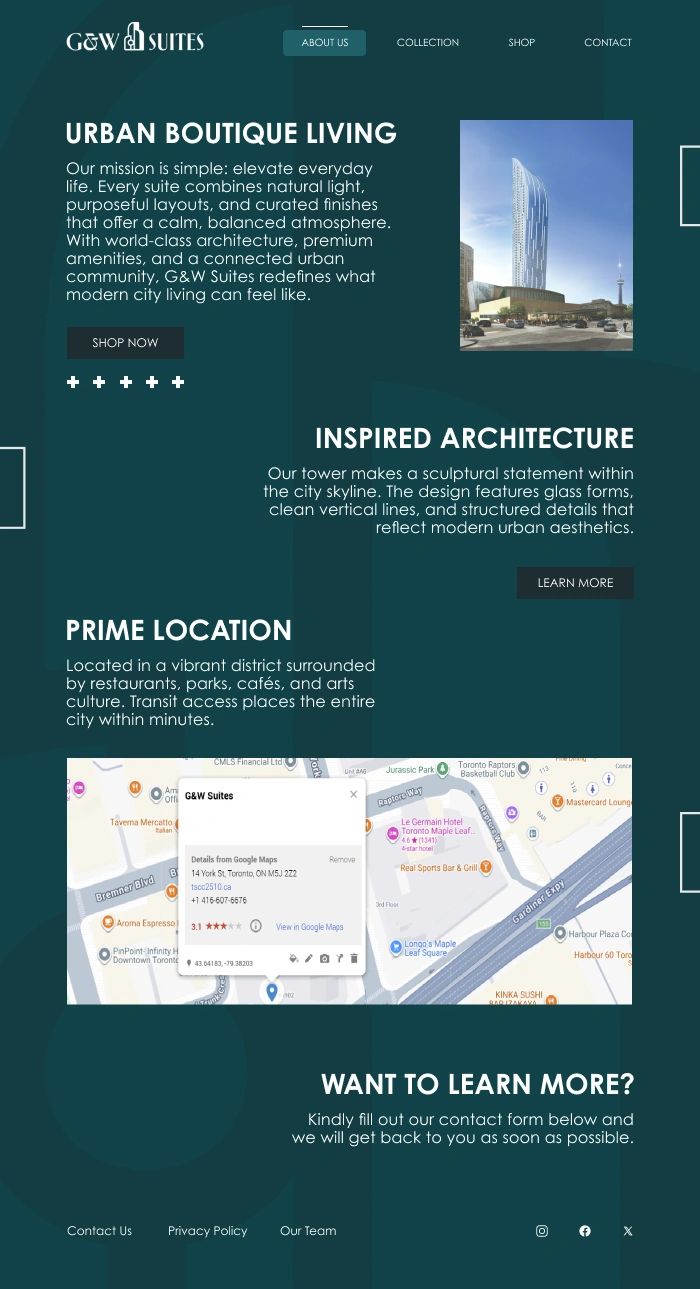
The overview pairs the “Urban boutique living” introduction with architecture, neighbourhood information, and a location map.
Explore
The collection page leads with an interior photograph, then adds a floor plan and shared amenities.
Consider
The residence screen brings together a release heading, suite description, pricing treatment, gallery, and tour prompt.
A shared route through the pages
The About Us, Collection, Shop, and Contact navigation appears across all three screens. A filled tab and a short light rule distinguish the current section. Repeated contact and footer links maintain a consistent page structure.
Visual system
One identity,
across three pages.
The mockups use a deep teal background, white typography, and oversized geometric brand shapes. This consistent frame gives the architectural and interior images room to stand out.
Hierarchy through scale
Bold uppercase headings introduce each section. Smaller body copy and compact action buttons separate explanation from the next step.
A rhythm of image and text
The overview alternates aligned text sections, while the collection and residence pages use wide photographs followed by more specific information.
Original project screens
Explore the mockups.
Select a page to see the original Figma design. Each screen can also be opened at full size.
Introduce the place.
The overview brings together the brand proposition, architecture, and surrounding neighbourhood. A location map adds a concrete point of reference to the lifestyle copy.
Open full-size screen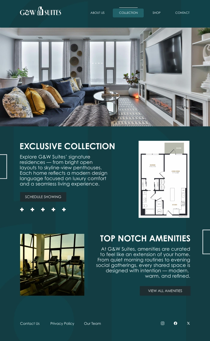
Connect lifestyle and detail.
A large interior photograph establishes the mood. The floor plan, amenities section, and showing prompt add the information and actions that follow.
Open full-size screen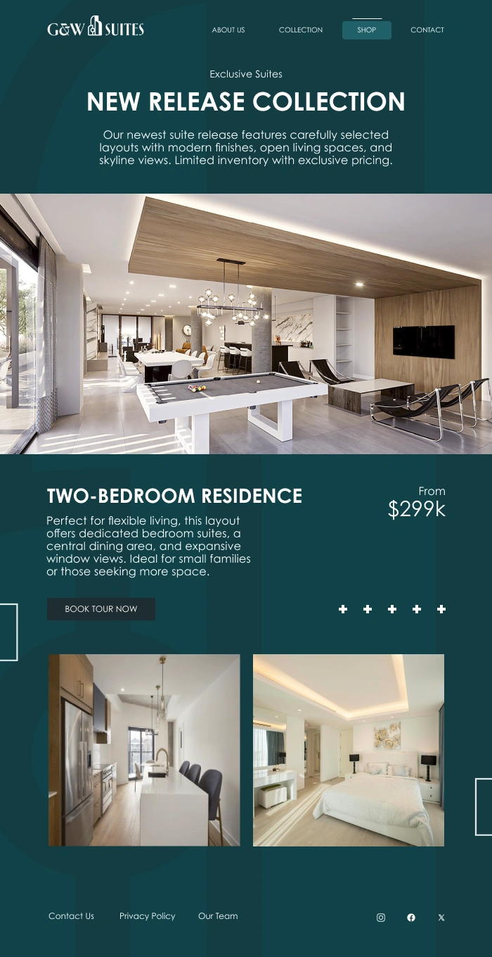
Bring a residence into focus.
The suite screen groups the residence description, pricing treatment, and tour action beneath a wide interior image. Additional photographs extend the visual presentation.
Open full-size screenOriginal screenshots exported from the supplied Figma file. Property imagery, marketing copy, map, and pricing are shown as part of the mockup.
View the original Figma projectNext iteration
From a visual concept
to a complete journey.
A next iteration would define responsive layouts and the inquiry flow, including what happens after “Schedule showing” or “Book tour now.” The contact invitation would need its form fields, validation, and confirmation state.
Useful questions to test would be whether visitors can distinguish the brand, collection, and residence pages, find practical information, and predict where each action will take them. Those observations could guide the next round of layout and navigation decisions.